


BRANDING FOR THE FASHION E-COMMERCE BASED IN NYC AND MILANO
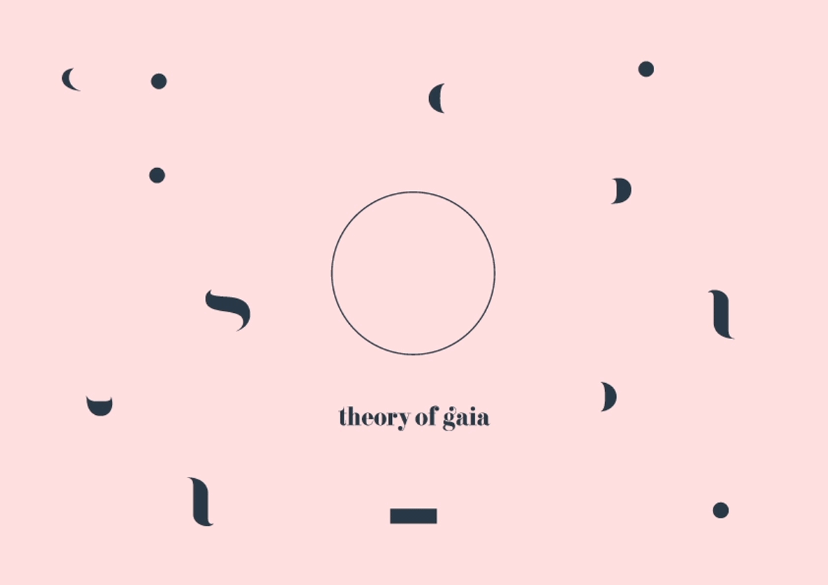
Logo and customized typo: high contrasts, curves and dots are main key elements on the typography chosen for the TOG branding.
All the 3 dots on top are alligned and the curly "g" gives a more sweet and feminine appeal to it.
Development of stationary basic elements keeping the bold and girly wave and soul of Gaia.
This iconic round seal has been created to be used on digital or secondary media, or as support mark for packaging.
All elements composing the word "gaia" can be mixed-up and disposed in a round, as the personal and inner world of Gaia. The effect is that it can be always the same but always different.
The whole project has been based on a semi-editiorial style, with weekly updates and news, around the Gaia's world.
All pictures of the stories are the first passage to buy, as directly from the pictures of the stories is possible to go and buy the product.
Photo stories has been taken with 2 teams in Milano and New York.
I have been in charge of the art direction and design for the brand-new debut of the fashion e-commerce project,
connecting Milano and New York City passing troguht Seoul.
I have been in charge of it from the day Zero setting up visual guidelines and direction, for a couple of years — 2014 to 2016, till the new ownership.